
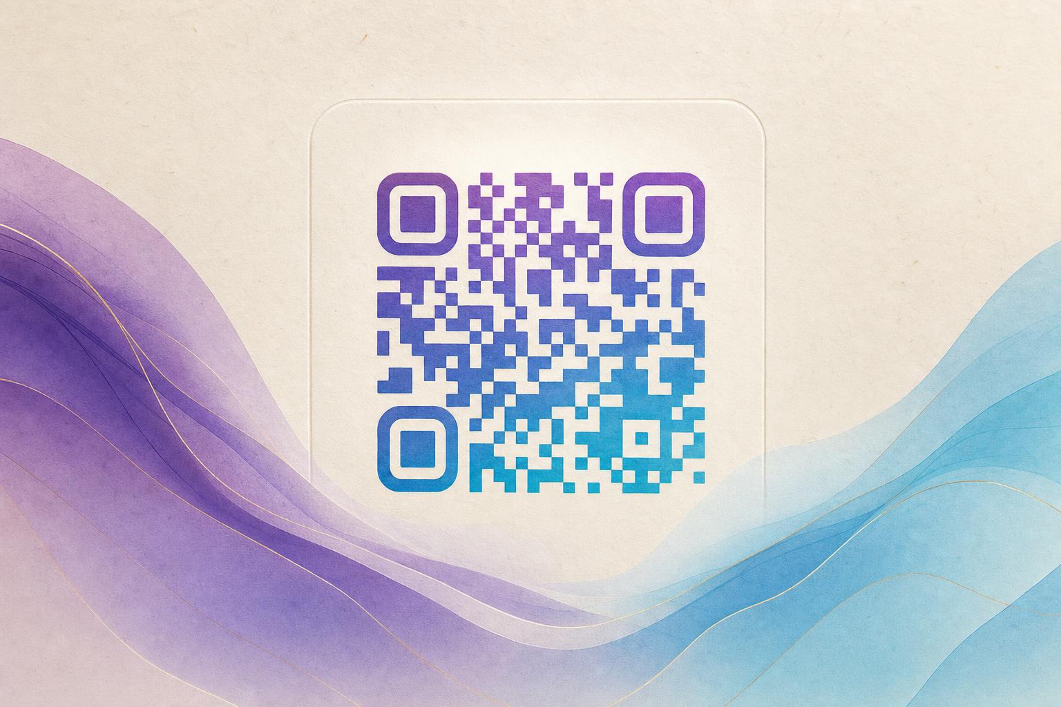
To beautify my QR code, the fastest route is to generate a new styled version from your destination link instead of trying to repaint an existing image. Upload a photo, pick a theme, and let an artistic QR generator blend the pattern into art while keeping the modules readable. Then test the scan, adjust contrast, and publish through a trackable redirect so you can change the link later without reprinting. Below is the full workflow, from choosing a style to running a scan test on real phones.
Step 1: Decide what the code has to do
Before you touch any design settings, write down the destination and the job. A menu code, a membership QR, and a campaign QR code all have different constraints. Ask yourself:
- What opens when someone scans? A URL, a landing page, a form, a Wi-Fi network, or a vCard.
- Where will it live? A printed poster, a product label, a table tent, a window decal, or a screen.
- How far away is the scanner? A code on a wall needs bigger modules than one on a business card.
- Will the link ever change? If yes, use a dynamic QR code from the start.
This step saves you from redoing the art later. A beautiful code that points to a dead page is worse than a plain one that works.
Step 2: Choose the beautification style that fits your brand
There are four main directions, and each one suits different use cases.
AI artistic QR codes
An AI QR code weaves the pattern into an illustration, a texture, or a scene. This is the best choice for posters, packaging, and social content where the code should look like part of the artwork. Use the AI Art QR generator to turn a prompt or a reference image into an AI art QR you can download.
Themed artistic QR codes
If you already have a visual theme, a themed artistic QR keeps colors, shapes, and framing consistent with the rest of the design. Think seasonal campaigns, event branding, or a series of posters that must look like a family.
Codes blended with a photo or logo
Blending works well for brands with strong marks. A logo fused into the center or a photo faded into the background makes a styled QR code that still reads as a code. Keep the logo small enough that the finder patterns in three corners stay untouched.
Animated GIF QR codes
An animated GIF QR is for screens: websites, digital signage, stories, and presentations. Motion draws the eye, but the code still needs a stable, high-contrast core frame so scanners can lock on.
Step 3: Generate the base code first
Always create a clean, working code before you decorate it. Enter your destination, shorten it if it is long, and download the plain version as a backup. A short link means fewer modules, and fewer modules means more room for art. If you plan to change the destination later, generate a dynamic QR code so the printed image never has to change.
Rule of thumb: the more artistic the design, the shorter the underlying URL should be.
Step 4: Beautify the QR code with art and color
Now open the design tool and apply your style. Work in this order so you do not fight the layout:
- Set the canvas shape. A circular QR code looks softer on badges, stickers, and social posts; a square one is safer for tight print layouts.
- Pick a palette with contrast. Dark modules on a light background scan best. Avoid low-contrast pairs like navy on black or pastel on pastel.
- Add the art layer. Choose a theme, upload a photo, or describe the scene you want. Let the tool blend the pattern into the image rather than pasting art on top of it.
- Place a logo or center icon. Keep it under roughly a fifth of the code area and test immediately after adding it.
- Round the modules if you like. A circular QR code generator can soften the dots without breaking the grid.
Stop adjusting once the code looks good at thumbnail size. If you cannot recognize it as a scannable code from across the room, it is too busy.
Step 5: Use hidden text art for a second layer
Hidden text art lets you place words inside the pattern so the code reads as a message up close and as a design from a distance. It is a strong fit for invitations, posters, and merchandise. Keep the hidden text in the same tonal family as the modules so it does not create false contrast that confuses a scanner.
Step 6: Test the scan like a real user
Design tools preview scans, but real devices are the truth. Run this checklist before you publish:
- Scan with at least two phones, one older model and one current one.
- Test in the exact lighting where the code will live, including glare from windows or spotlights.
- Print a proof at final size and scan from the expected distance.
- Try the native camera app and a third-party scanner.
- Check the destination page on mobile, not desktop.
If a scan fails, the usual culprits are low contrast, an oversized logo, a busy background behind the code, or a print that is too small. Fix one variable at a time.
Step 7: Publish with tracking and a smart redirect
A beautiful code deserves measurement. Route it through a trackable QR code with a custom short link so you can see scan counts, locations, and times. A smart QR redirect lets you send the same printed code to different destinations by device, language, or campaign phase. If you are running a promotion, this is where QR code marketing actually pays off: one design, many tests, no reprints.
For brand consistency, use a custom QR domain so the link under the code matches your website instead of a generic shortener. It looks cleaner on print and builds trust with anyone who reads the URL before scanning.
Step 8: Keep the design system reusable
Once you land on a look that scans reliably, save the settings. Reuse the same palette, module style, and logo placement across every new code so your QR branding stays consistent. For a series of posters, build the layout once in a poster generator or online poster maker, then swap the code and the headline. That turns a one-off design into a repeatable workflow.
Common mistakes to avoid
- Decorating before testing. Always confirm the plain code works first.
- Covering the finder patterns. The three corner squares must stay intact.
- Using a long URL in a heavy design. Shorten first, then beautify.
- Ignoring print size. Small codes on textured paper fail quietly.
- Forgetting the fallback. Add a plain text URL near the code for anyone who cannot scan.
Beautifying a QR code is a design decision and a technical one at the same time. Choose the style that serves the placement, keep contrast high, test on real phones, and publish through a dynamic redirect so the code can grow with your campaign. Do that, and a code that used to be an afterthought becomes part of the artwork.